Chaconne
For one Typography class, we were to create a brochure as well as a poster for a mock New York City ballet production. I specifically remember having fun with this project, as it was the first time we did a large format poster design. Normally we did just tabloid printings, but this one was a whopping thirty-six by eighteen inches! This was also the earliest known piece to start showing my modern, thin line, love for design. The movement within this piece is always pleasing to view as you are guided around the form of the dancer, and brought straight to the information one would need to know. Very seamless in its presentation to just be a map for your eyes to follow. Almost making the title invisible until your eyes zoom out and see it all in one picture. However, for the brochure, we were forced to make it using different colors but try to use similar design rules as the poster to make them seem coherent. This will always be a fun class to reminisce about, I even have my progress!

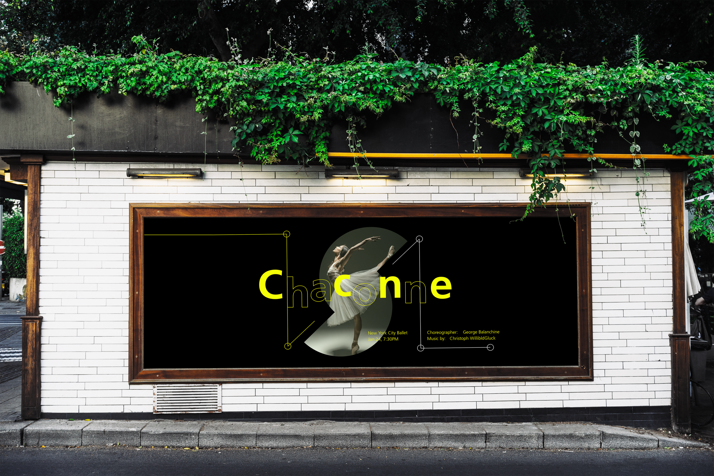
The Finished Poster. With all works, looking back there is stuff I would change, but I do love how movement is suggested here. The lines following the flow of the ballet dancer, all coincide so well to promote a dramatic undertone and leave the viewer asking for more. Being a large format it was intended to have some empty space to create breathing room from the surroundings of where this piece would be posted. Seeing this in person was so satisfying in the end.
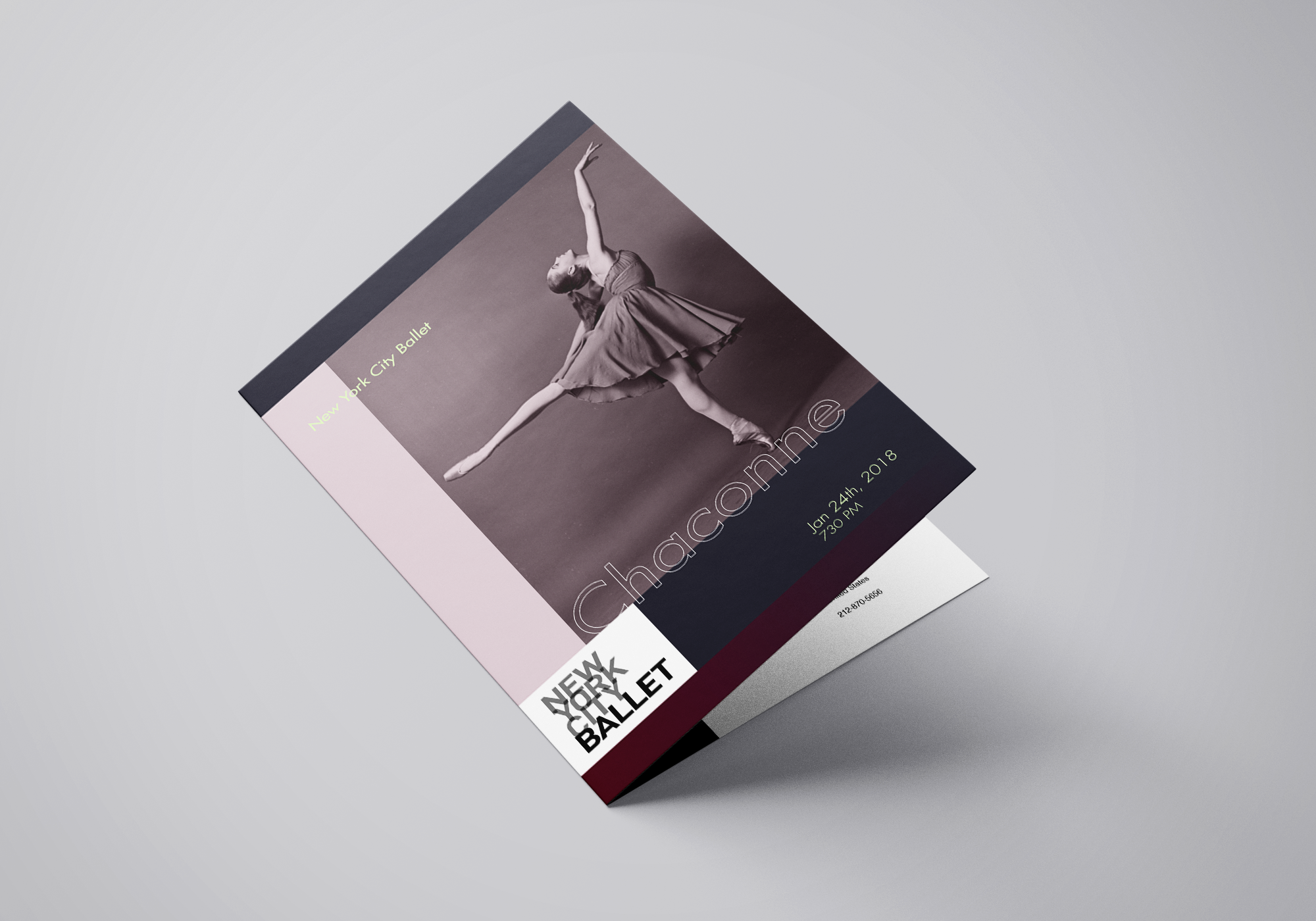
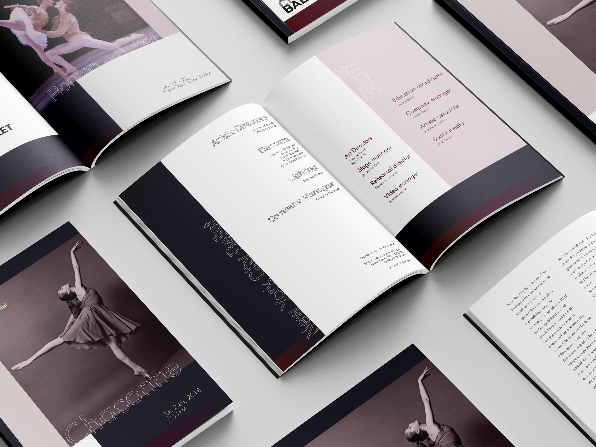
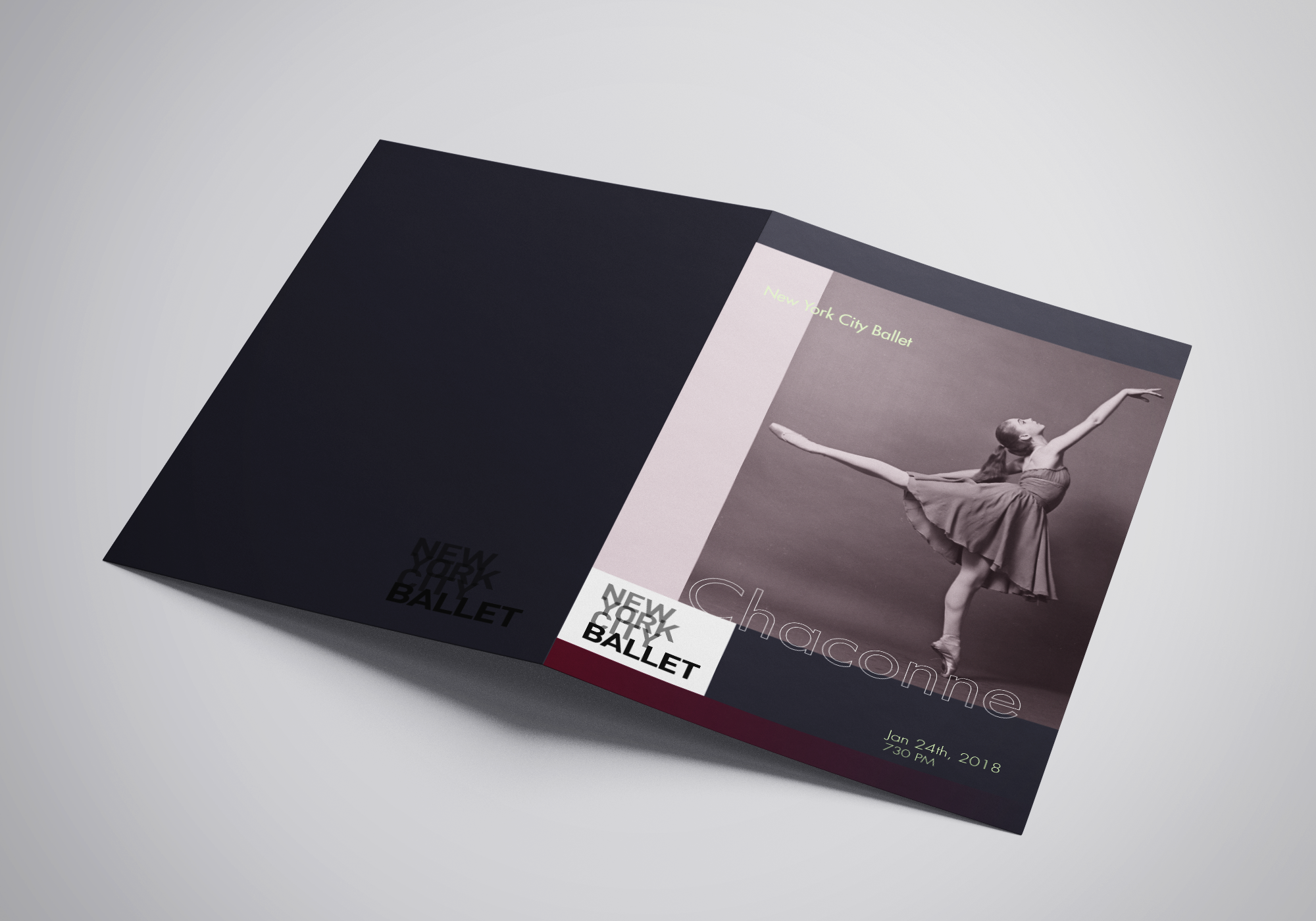
Paper paper paper! I love working with books and stacked paper. The feeling of getting everything fit onto the grid and presenting a narrative through visuals is always pleasing. But also, the actual feeling of the paper is always important! This brochure was printed on soft-touch paper giving it an overall premium feel, one that is expected within a ballet.
Poster Mock Up
Above is what the poster would look like as if it were really promoting a ballet! Below we have my other two ideas for what I could’ve done for this project! I’m proud to have gone with the one I did, the darkness really worked for this poster.

Rough Draft
